Today the Microsoft update on my Windows machine asked me to upgrade the Internet Explorer to version 7.0. My bank refuses to work with any browser other than IE, so, although I'm using SeaMonkey as my everyday browser, I'm also forced to keep a current copy of IE. The installation's banner reinforced some of the fears I have regarding Microsoft's technical prowess.
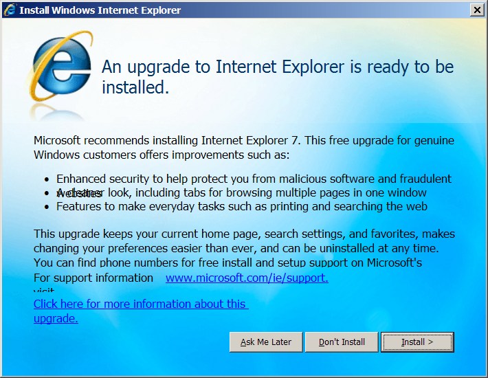
The banner asking me to perform the installation appeared like
a quick last-minute hack implemented by a novice programmer.
Ironically, the line claiming something about a cleaner look appeared garbled,
while the word "visit" on the line containing support instructions
managed to move to a line below.
I can't really think how one can botch a simple dialog box this badly,
but these problems
- indicate that there's something seriously wrong with the technologies Microsoft uses for building its products,
- demonstrate that either Microsoft's quality control and testing procedures are inadequate, or that testing is very difficult to perform in a comprehensive way,
- don't inspire me confidence for the rest of the Internet Explorer.


Unix make vs Apache Airflow (2024-10-15)
How (and how not) to present related work (2024-08-05)
An exception handling revelation (2024-02-05)
Extending the life of TomTom wearables (2023-09-01)
How AGI can conquer the world and what to do about it (2023-04-13)
Twitter's overrated dissemination capacity (2023-04-02)
The hypocritical call to pause giant AI (2023-03-30)
AI deforests the knowledge’s ecosystem (2023-03-16)
How I fixed git-grep macOS UTF-8 support (2022-10-12)
Last modified: Friday, December 15, 2006 3:10 pm
Unless otherwise expressly stated, all original material on this page created by Diomidis Spinellis is licensed under a Creative Commons Attribution-NonCommercial 4.0 International License.