A couple of months ago I prepared the slides for a paper I will present at the 30th International Conference on Software Engineering. After reading Garr Reynolds's book Presentation Zen: Simple Ideas on Presentation Design on Presentation Design and Delivery I became enlightened, and I decided to redo the presentation from scratch, creating less cluttered, more focused, and simpler slides.
I modelled many slides in the original presentation after the corresponding
figures in the paper.
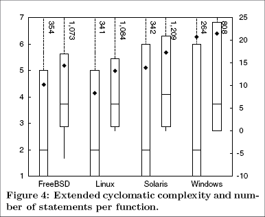
I originally composed the paper's figures trying to squeeze as much data as
possible into the fixed number of pages that the conference allocates to
each author.
Here is the slide from the original presentation.
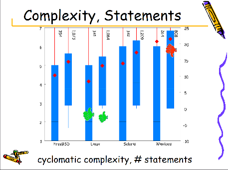
As you can see, I added to the already cluttered composition an additional
title, more icons, and the elements from the presentation's template.
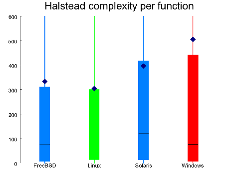
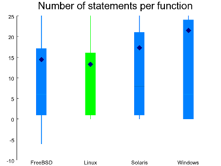
After the makeover I split the slide into two, removed all non-essential
elements, and used color to convey the slide's main point.
I also replaced the Comic Sans typeface,
which has even spurred movement to ban it,
with the plain Arial font.
The slides convey slightly less information, but nobody will miss that
during the 25 minute talk.
Those wanting more details can always turn to the paper, which will
be distributed to all conference attendants.


The hypocritical call to pause giant AI (2023-03-30)
AI deforests the knowledge’s ecosystem (2023-03-16)
How I fixed git-grep macOS UTF-8 support (2022-10-12)
The sorry state of software quality (2022-03-10)
Rather than alchemy, methodical troubleshooting (2021-11-27)
The Evolution of the Unix System Architecture (2021-06-18)
Reviving the 1973 Unix text to voice translator (2021-01-02)
Fast database UPDATE/DELETE operations (2020-12-10)
Raspberry Pi 400 vs ZX Spectrum (2020-11-02)
Last modified: Monday, April 28, 2008 0:12 am

Unless otherwise expressly stated, all original material on this page created by Diomidis Spinellis is licensed under a Creative Commons Attribution-NonCommercial 4.0 International License.